

It’s out with the old and in with the new as Nokia finally rebrands.
Nokia announced its plans of changing its brand identity and has now redesigned its logo.
According to Nokia’s President and CEO, Pekka Lundmark, people still associate Nokia with mobile phones even though it now focuses on networks and industrial digitalization. The company’s strategy is divided into three stages: reset, accelerate, and scale.
Nokia is now starting the second stage after completing the reset stage.
New Logo with a Modern Touch
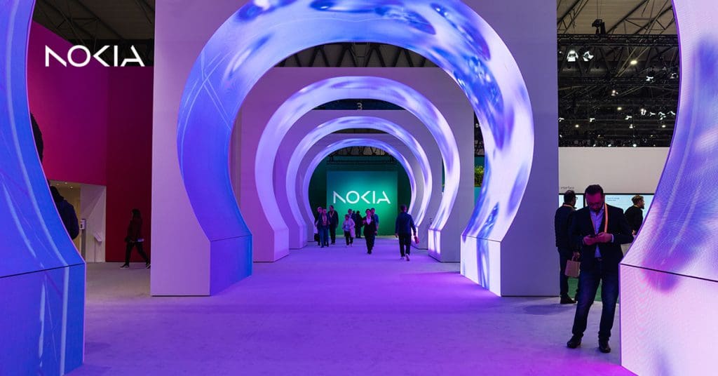
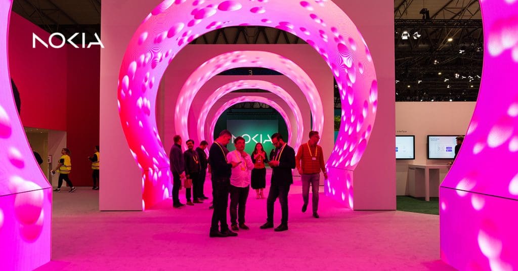
Nokia has now officially launched its new logo after completing the first stage of its rebranding. The logo still consists of the word “NOKIA”, however, it now has an even more modern touch. The blue-colored logo has bid adieu and has now been replaced with a variety of new colors.
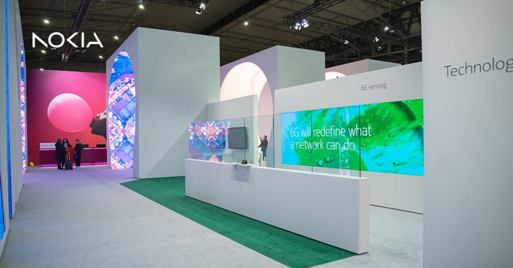
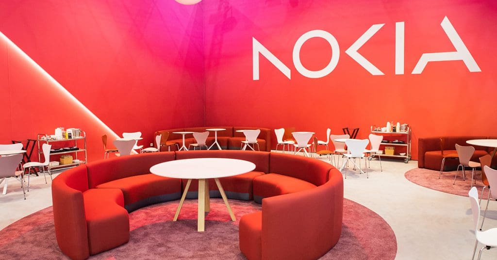
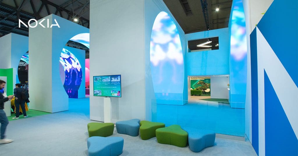
Nokia’s website has now also been updated according to the company’s new brand identity.
What do you think of Nokia’s new logo and future rebranding? Any thoughts? Comment down below.
Nokia used to be my dream phone. Their brand (name) started out strongly when I was in high school. But 2 decades later, it seems unknown to the world. Or, you know, only old people know them. And now, with their re-branding, I will surely support it. And make sure that my new smartphone, (as I’m about to replace this almost 3-year old smartphone from Asus) will have their logo. Excitinggg!! #GoNokia